
TDC Show
Ok , well as the title says someone has to much time on their hands, they're also amazing.
, well as the title says someone has to much time on their hands, they're also amazing. i found this poster after the other week in history doing Art Nuvoe, also us dips are doing typography at the time which this poster is all typography, no image or line, just typography.
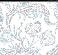
This is a poster for "The Type Directors Club of New York, 54th TDC Show" and it is really just amazing. Even though as Marty pointed out thats its verticaly mirrored, it just has perfect symmetry except for the main text and the logos which are most likely sponsors for the show.
The colour scheme is Split Complementary, the detail put in this piece shows great use of perspective.. in the centre point the typography goes smaller and smaller making it look likes its far back but it centres the Type Directors Club logo which is a different colour to the rest of the piece.
The typography kind of speaks for it self, like you can tell that the show is going to be about type with out even reading the proper text.
Anyway this is great, i love it.
The Other 2
the other two pieces are again amazing all pure typography, the blue and grey one is pretty, but not so pretty words if you read it, which is probally why its blue and grey because really its pretty cold and mean. while the the red one is pretty and full of love which would why it is red/pink which shows love & passion.
Stuff like this frustrates me, I just dont know how someone could do it. but hey its great, its just i bet the person who made it would have no friends or has never seen the day light before. F*cking nerds!HA!
ReplyDelete