Wednesday, March 25, 2009


I also got this ad out of the Marie Claire April 2009.

Its advertising L'Eau d'Issey, A Drop of Cloud by Issey Miyake.

The layout is 2/3 with the image. I think it has to much information personaly and the header dosent look right beacuse it dosent have a capital c at the start. The shadows on the image make it look placed, not just floating with makes it look unstable.

In the body text on the first sentance it mentions previous perfumes which is a great marketing technique.

The whole ad is very easy on the eye, and is pretty much all white and grey, reinforcing the "a drop of cloud'.

The product it self. It sits in a preety white box, the graphics on it seem like clouds (funked up clouds), it has gentle shades of silver maybe from the saying 'each cloud has a silver lining' but it also has a kind of powder pink which depict the feminine kind of sophistication of L'Eau d'Issey.


I got this beautiful ad out of the Marie Claire mag April 09.

Its advertising Cremant's Vintage YELLOWGLEN. Its very much influenced by Art Nuevoue. The product is centered which makes it look heavenly and the background fades in the centre which brings the image forward.

The ad itself has no explaining, no address or number, just what it is. So the viewer can just go into the bottleo and look for the beautiful silver vines.

The bubbles twirling around the bottle are linked to the 'Vintage Bubbly' text. This ad makes me think that the people aimed for would be people in their 20's that want to act a bit classy.

Monday, March 23, 2009

Someone has got to much time on their hands.


                                         TDC Show
Ok
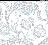
, well as the title says someone has to much time on their hands, they're also amazing. 

i found this poster after the other week in history doing Art Nuvoe, also us dips are doing typography at the time which this poster is all typography, no image or line, just typography. 

This is a poster for "The Type Directors Club of New York, 54th TDC Show"    and it is really just amazing. Even though as Marty pointed out thats its verticaly mirrored, it just has perfect symmetry except for the main text and the logos which are most likely sponsors for the show.

The colour scheme is Split Complementary, the detail put in this piece shows great use of perspective.. in the centre point the typography goes smaller and smaller making it look likes its far back but it centres the Type Directors Club logo which is a different colour to the rest of the piece.  

The typography kind of speaks for it self, like you can tell that the show is going to be about type with out even reading the proper text. 

Anyway this is great, i love it. 


The Other 2
the other two pieces are again amazing all pure typography, the blue and grey one is pretty, but not so pretty words if you read it, which is probally why its blue and grey because really its pretty cold and mean. while the the red one is pretty and full of love which would why it is red/pink which shows love & passion.

I found this while researching interesting typography, & always seem to bump into the ones that have rude words but oh well they still look good. 

Even though this one dosent actually say it you can still read it all very clear. The primary colours make it feel basic which contrasts with the out there typography. The blue & red split it all up so a comer didnt have to be used. the letters are transparent and overlap where needed to show the make a letter. The yellow background would make the viewer stand out, even though it dosent say or mean much it still makes you look. 

The whole 'FUCK PROPER TYPOGRAPHY IT IS ALL BULLSHIT'  is empathized with the typography used which is rather smart i think and its saying that you shouldnt go with the rules (like DADA really). 


Ok, now the Ugly Mug Coffee Co., These guys are awesome. There ads are bold, pretty much like the ads seen during the industrial revolution perhaps?  There BIG & BOLD and in your face, yet its so tempting to read it because it looks so intresting and the header(which is also a different colour to the body text) makes you want to read on. it kind of made me think that the person who wrote it had maybe has a energy hit (obviously from an Ugly Mug Coffee) and theyre just hell hyper. 

I like that each product has a different colour scheme, which helps the customers especially if theyre sending their kid down o get it, they could just say to get the one with the grey writing for example. 


I found these guys while looking at all different coffee packaging. just google Puccinos or on flickr.com and you'll see everything they have.

These are from Puccino's, theyre very intresting, id just go there to see what cup i get. and keep getting them till i get everyone. 

the colours used arent bright, which makes it easy on the eye while your trying to read the dodgy handwritten sayings. 

The hand writing is obviously just there thing, totally opposite from their competitors which are all fancy and would make you look higher class with your Starbuck or Dome coffee with the logo as a badge and the serif fonts.  Puccinos is very casual and easy. almost like who ever designed them needs a coffee. 

I love the sugars, the raw sugar (above) and the white sugar (you'll have to look it up your self if your intrested) have pretty nifty saying on them, reminds me of a sugar ive kapt for ages on it which says 'with your luck it's probally salt'. 

The sayings on each cup give it a personality, which when the customers has one it makes them feel special and because its hand written it gives the effect that it was hand made just for them (which really the coffee was, not nessicerily the cup it self).

They also have ' Flat Still Water' and 'Bumpy Sparkling Water' these guys are wicked the Flat water says 'Sip nonchalanty whilst shaking head at fizzy water drinking showoffs', while the Bumpy water says 'Go up to the person with still water & tell the they're boring.' so even though theryre just water bottles, but they have attitude just like the coffees, sugars & biscuits. 

 But i love them. They're brilliant! :)


This was also from the ilovetypography website, its obviously a clock, (a freakan awesome one). 

The text is hard to read untill the hour hand goes over it. then it boarders it and everythings all good. 

I think this is great, especially for a common household item, although clocks have always been a tad out there.